Pierre Huyghe After ALife Ahead
“A disused ice rink on the outskirts of the small German city of Münster is currently breeding cancer cells. Part of this year’s Skulptur Projekte Münster, a decennial art event spearheaded by influential curator Kasper König that sees more than 35 projects scattered in its city center and greater environs, the ice rink is in fact a work by the French artist Pierre Huyghe, After ALife Ahead. Along with the cancer cells, Huyghe has placed bees, peacocks, and algae inside the excavated hangar-like structure, transforming it into a living organism and animating it via an augmented reality app.” via https://www.artsy.net/article/artsy-editorial-pierre-huyghes-latest-project-biotech-lab-scene-sci-fi-film
Peter Burr, Pattern Language
Video game dungeons, architecture, and flashing pixels all inform artist Peter Burr, new exhibition Pattern Language, named after architect Christopher Alexander's design method which Burr explains as "describing the aliveness of certain human ambitions through an index of structural patterns… The piece, a collaboration with game designer and writer Porpentine Charity Heartscape, is part of a continuing project, a video game called Aria End.” via VICE https://www.vice.com/en_au/article/z4qaay/installation-death-labyrinth-video-game-strobe.
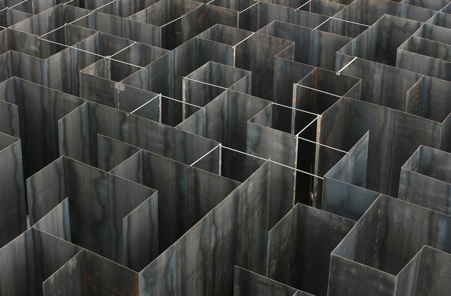
Gijs Van Vaerenbergh, Labyrinth
The Belgian duo, collectively known as Gijs Van Vaerenbergh, have created ‘Labyrinth’, a sculptural-spatial intervention based on the artists' interest in fundamental architectural typologies. Using unique compositions of wall and void, the labyrinth stands at 37.5m (123ft) at its highest points and is comprised of 5mm thick steel plates geometrically hollowed to create a collection of frames… According to the architects, “through a monotonous succession of high corridors, the viewer is confronted with openings that reveal what is on the other side of the walls.” via CLAD http://www.cladglobal.com/CLADnews/architecture-design/Gijs-Van-Vaerenbergh-create-Labyrinth-maze-for-Genk’s-c-mine-arts-centre-in-Belgium/317150
Mike Nelson, Imperfect Geometry
“Imperfect geometry for a concrete quarry consists of approximately 3,500 concrete blocks laid out in their strict repetitive geometric pattern. Here, Nelson allows the suggestive and enigmatic patterns of Oriental art to encounter and tie in with Western art’s rational minimalism. The work influences us physically through its weight and size but also intellectually via its almost meditative nature. In the raw concrete surface each block bears traces of its own process of inception and production.” via Domus https://www.domusweb.it/en/news/2016/03/14/mike_nelson_imperfect_geometry_for_a_concrete_quarry.html
Yona Friedman, Ville Spatiale
Principe imaginé dès 1959 par Yona Friedman, la Ville spatiale est une structure spatiale surélevée sur pilotis, qui peut enjamber des zones non constructibles ou même des villes existantes. « Cette technique permet un nouveau développement de l'urbanisme : celui de la ville tridimensionnelle ; il s'agit de multiplier la surface originale de la ville à l'aide de plans surélevés » (Friedman). via http://www.frac-centre.fr/collection-art-architecture/rub/rub-64.html?authID=72&ensembleID=164. see also https://www.youtube.com/watch?v=gstOx9egIf4 (trial and error)
Melvin Prueitt, Errors
“Two double spreads from Melvin L Prueitt’s Computer Graphics (1975) standout among the perfect parabolic topologies and wireframe nuclear spectra – a selection of graphical rendering errors, possibility some of the earliest examples of glitch art to appear in print. Looking like disjointed plots of a (dis)locative media project gone awry or poorly planned subway systems, the renderings present numerical malfunction as cryptic sign.” via https://www.dataisnature.com/?p=2367
Charles Csuri, Tactile Kinesthesis
“My esthetic sensibility becomes imbedded in the computer language. The computer responds to my excitement and feeling through my instructions. It gives me real-time feedback as I see my image on the monitor. Outwardly, this has become my new canvas. I work back and forth altering the relationships between objects, colors and textures in a world space.”
— Charles Csuri, 1998. via http://www.csurivision.com/index.php/2012/02/tactile-kinesthesis/#more-478
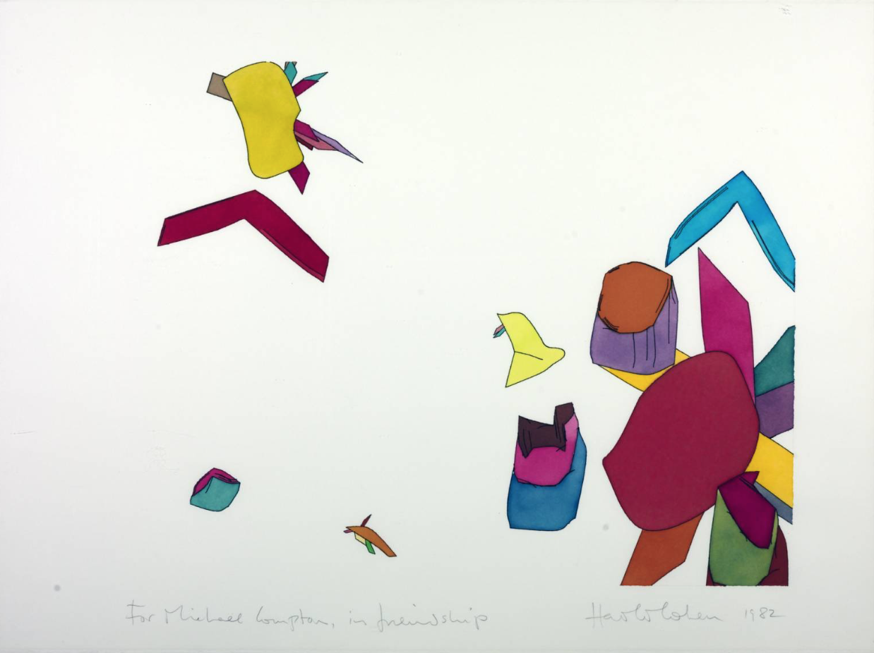
Harold Cohen
“Harold Cohen was a British-born artist who was noted as the creator of AARON, a computer program designed to produce art autonomously. His work in the intersection of computer artificial intelligence and art attracted a great deal of attention, leading to exhibitions at many museums, including the Tate Gallery in London, and acquisitions by many others.” Wikipedia via https://www.tate.org.uk/art/artists/harold-cohen-925
Machine Fallibility and Emergent Weirdness
“If we continue on the current trajectory, the musical singularity promises us no more than consumerist re-enactments of dead composers and deceased pop stars. Forget AI's obsession with hyper-personalised music, AI musicbots, algo-curators, recommendation engines. Forget about location-based musical concierges and mood-detected playlists of music in the style of [insert your favourite composer here]. The real radical breakthrough in AI music will arrive with the composition of impossible music - complex alien algorithmic polyrhythms drenched in estranged DSP timbres - music that humans could never have conceived and never expected to hear.” Paul Prudence via https://www.transphormetic.com/Published-Essays-Articles-in-Print
Expansions
"En 1967, César découvre la mousse polyuréthane et sa capacité d’expansion. Le fait de pouvoir faire des œuvres de grande dimension très légères le séduit aussi. Ce médium va donner lieu à une nouvelle série : les Expansions. cette série s'oppose à la serie des Compressions. Il laisse couler de la mousse polyuréthane sur le sol, ou bien à partir d’un support. Il joue sur les mélanges, sur les temps de solidification, et, à l’instar des compressions, il peut aussi diriger la coulée." via http://cesarbaldaccini.blogspot.fr/p/demarche.html
Cyprien Gaillard
"Cyprien’s work reflects the acceptance introduces what he calls post-entropy, where he tries to recuperate the natural decadence in history. His art pieces show the progression of this ideology, starting with his 35mm footage of clouds of smoked provoked as acts of vandalism he evolves to his contemporary archaeological researches of ruins spread across the globe." via http://www.datura.com/blog/cyprien_gaillard/
Chalkroom
"The piece allows viewers the opportunity to travel not only into the space of imagination a story creates, but into the very architecture of story itself—to walk, or rather float, through its passageways as words and letters drift by like tufts of dandelion, stars, or, as Anderson puts it, like snow. “They’re there to define the space and to show you a little bit about what it is,” says the artist... “But they’re actually fractured languages, so it’s kind of exploded things.” She explains the “chalkroom” concept as resisting the “perfect, slick and shiny” aesthetic that characterizes most computer-generated images. “It has a certain tactility and made-by-hand kind of thing… this is gritty and drippy and filled with dust and dirt.” by Laurie Anderson, via openculture
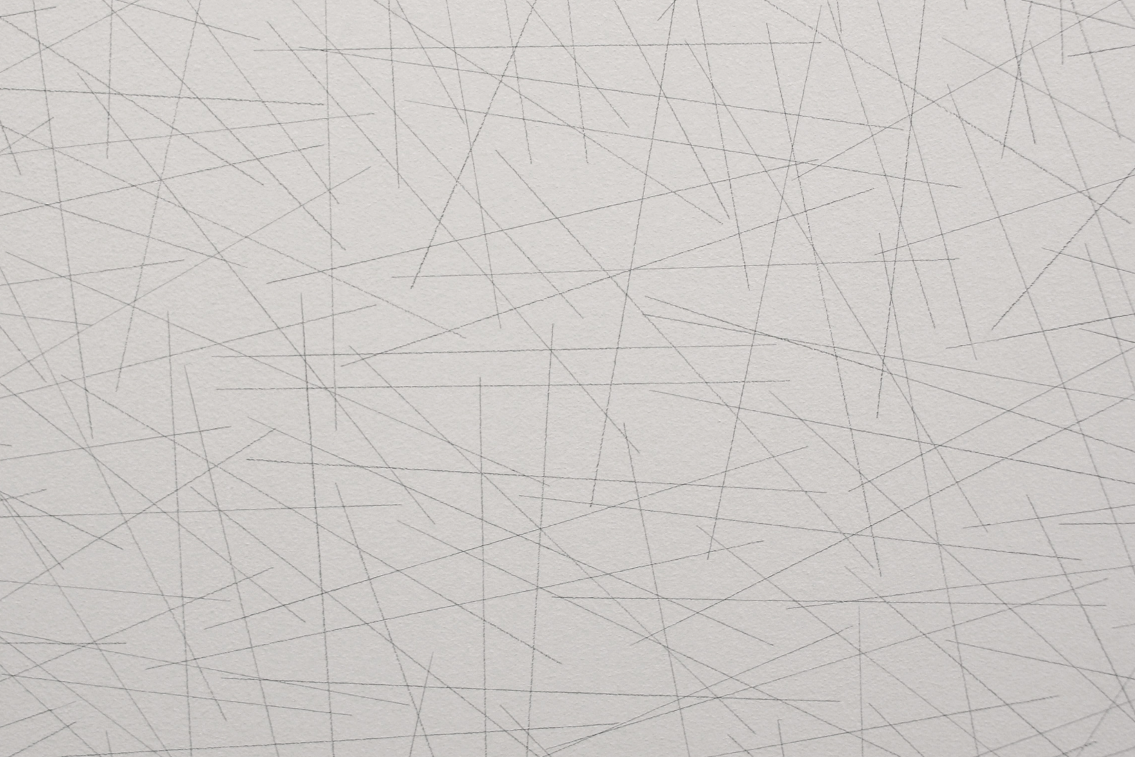
Sol LeWitt WallDrawing86
“In 1970, Sol LeWitt further distilled the formal vocabulary he used in his wall drawings… Noteworthy in Wall Drawing 86 is the disparity between the simplicity of the instructions and the seeming chaos they produce on the wall. The number of lines drawn here is derived from a traditional Eastern concept that ten thousand is a unit emblematic of all inconceivably large numbers. Lines are applied at the singular discretion of the draftsman, who is instructed only to maintain the length of the lines and appearance of evenness across the surface of the wall. The even distribution is conditioned by the dimensions of the wall, giving each iteration of the drawing a different level of density. Other aspects of the lines (their orientation, how often they intersect each other, etc.) are decided by the draftsman as the drawing progresses. The operation of restriction and flexibility results in a visual marriage between pattern and intuition.” via https://massmoca.org/event/walldrawing86/
Kinetic Light
Spectra-3 is an immersive audio-visual light experience: A physical-digital sculpture that tells three stories of communication through a choreography of movement, animated lights and spatialised sound. https://www.field.io/project/spectra-3/
Galaxy
"This kinetic sculpture was fashioned from metal struts and synthetic string (a clothes line). Electric motors animated the heart of the structure, changing its angular forms to the accompaniment of music, and at night Galaxy was illuminated with coloured lights. The piece represents the aspiration of the group to imagine new models of public sculpture for the new urban centres being planned across the Soviet Union. On the eve of a visit from senior figures in the Moscow Party hierarchy, Galaxy was the subject of an ‘ideological’ inspection. Infante and his colleagues were judged to have gone too far in their enthusiasm for the abstract beauty of geometry, and were required to dismantle the artwork" David Crowley https://faktografia.com/2011/09/13/the-art-of-cybernetic-communism/
Pathfinder
"»Pathfinder« is a generative approach for the conceptual choreographic research of body movements. Through a process of guidance, the work becomes a medium of communication and explores the boundaries between inspiration and improvisation" via http://onformative.com/work/pathfinder
Particle Falls
"American environmental artist Andrea Polli’s Particle Falls, a real-time reactive light projection will be displayed on the façade of the Mona Bismarck American Center as part of ArtCop21, the official cultural program accompanying the 21st United Nations Conference on Climate Change (COP21). A large-scale public installation visible every evening from 6 PM, Particle Falls acts as a monitor, an alarm, and a thing of beauty simultaneously, allowing the public to see current levels of air pollution as a digitally generated lightshow that changes and adapts in real time. The installation will be accompanied by a round table discussion on the intersection of art, environment and activism." via http://www.artcop21.com/fr/events/andrea-pollis-particle-falls/
Photo Electric Viewer Programmed Coordinate System
"Haacke's systems have a limited life as an art experience, though some are quite durable. He insists that the need for empathy does not make his work function as with older art. Systems exist as on-going independent entities away from the viewer. In the systems hierarchy of control, interaction and autonomy become desirable values. In this respect Haacke's Photo-Electric Viewer Programmed Coordinate System is probably one of the most elegant, responsive environments made to date by an artist... Boundary situations are central to his thinking."
A "sculpture" that physically reacts to its environment is no longer to be regarded as an object. The range of outside factors affecting it, as well as its own radius of action, reach beyond the space it materially occupies. It thus merges with the environment in a relationship that is better understood as a "system" of interdependent processes. These processes evolve without the viewer's empathy. He becomes a witness. A system is not imagined, it is real.
From System Aethetics, Jack Burnham 1968 pg 35
Haus-Rucker-Co Oase No. 7 (1972)
Taking their cue from the Situationist's ideas of play as a means of engaging citizens, Haus-Rucker-Co created performances where viewers became participants and could influence their own environments, becoming more than just passive onlookers. These installations were usually made from pneumatic structures such as Oase No. 7 (1972), which was created for Documenta 5 in Kassel, Germany. An inflatable structure emerged from the façade of an existing building creating a space for relaxation and play..." via http://www.spatialagency.net/database/haus-rucker-co


